
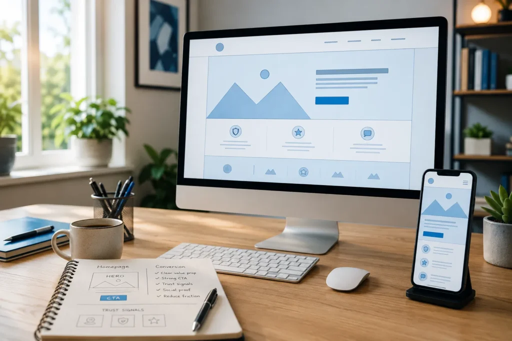
Quick Answer: A homepage that converts focuses on three things: a clear value proposition above the fold, a single primary call-to-action, and trust signals that reduce visitor anxiety. The real work is prioritizing clarity over creativity — answering "who is this for and what outcome does it deliver" within seconds, and removing every element that doesn't move visitors toward becoming a lead.
Key Takeaways
- A solid small-business homepage conversion rate falls between 2-5%; pages below 2% typically suffer from clarity, trust, or friction issues
- The hero section must answer "who, what, outcome" in plain language within the first screen
- One primary CTA per page outperforms multiple competing buttons
- Trust signals like testimonials, client logos, and certifications reduce anxiety and increase form submissions
- Mobile optimization is non-negotiable for conversion performance
- Homepage copy should tightly match the visitor's search intent and ad promises
- A/B testing one element at a time produces the most reliable conversion improvements
- Landing pages typically convert at higher rates than homepages because they focus on a single offer
What Makes a Homepage Convert Visitors Into Leads
A homepage converts when it immediately communicates value, builds trust, and guides visitors to a single action with minimal friction. The best homepages answer three questions in the first few seconds: What do you offer? Who is it for? What should I do next?
Homepage conversion rate best practices center on five pillars:
- Clarity: Visitors should understand your offer within 5 seconds
- Relevance: Copy must match what visitors searched for or clicked on
- Value: Benefits should outweigh perceived cost or effort
- Trust: Social proof reduces anxiety about taking action
- Friction: Fewer form fields, faster load times, and simpler navigation increase conversions
A 2-5% conversion rate is generally solid for small-business homepages. Pages below 2% usually have problems in one or more of these five areas .
What Should Be Above the Fold on a Homepage
Above the fold, a converting homepage needs four elements: a benefit-driven headline, a supporting subheadline, one primary CTA button, and a relevant hero image. This combination answers "who, what, outcome" before the visitor scrolls .
Decision rule: If a visitor can't tell what you do and what to do next without scrolling, the above-the-fold section needs a rewrite.
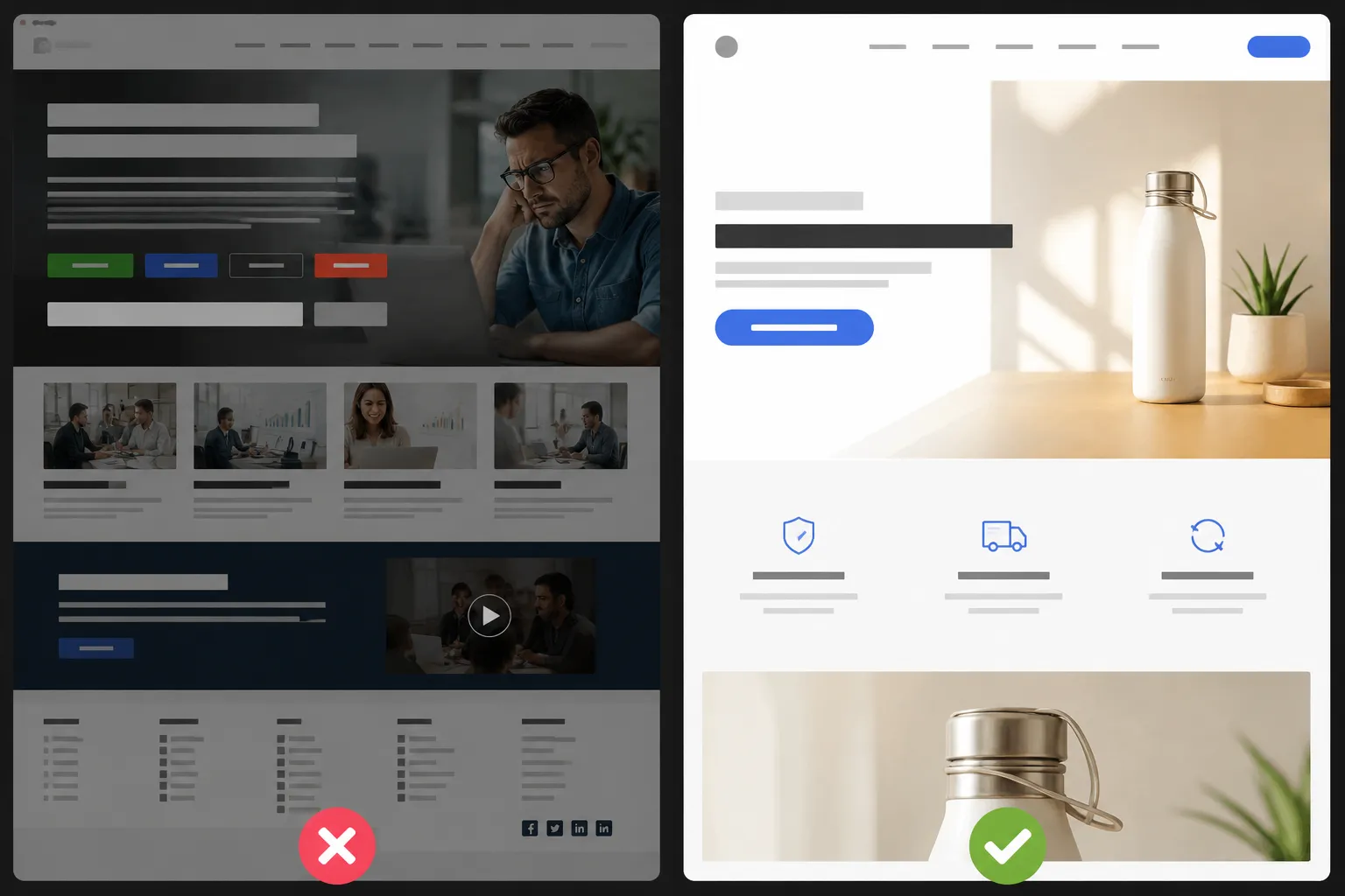
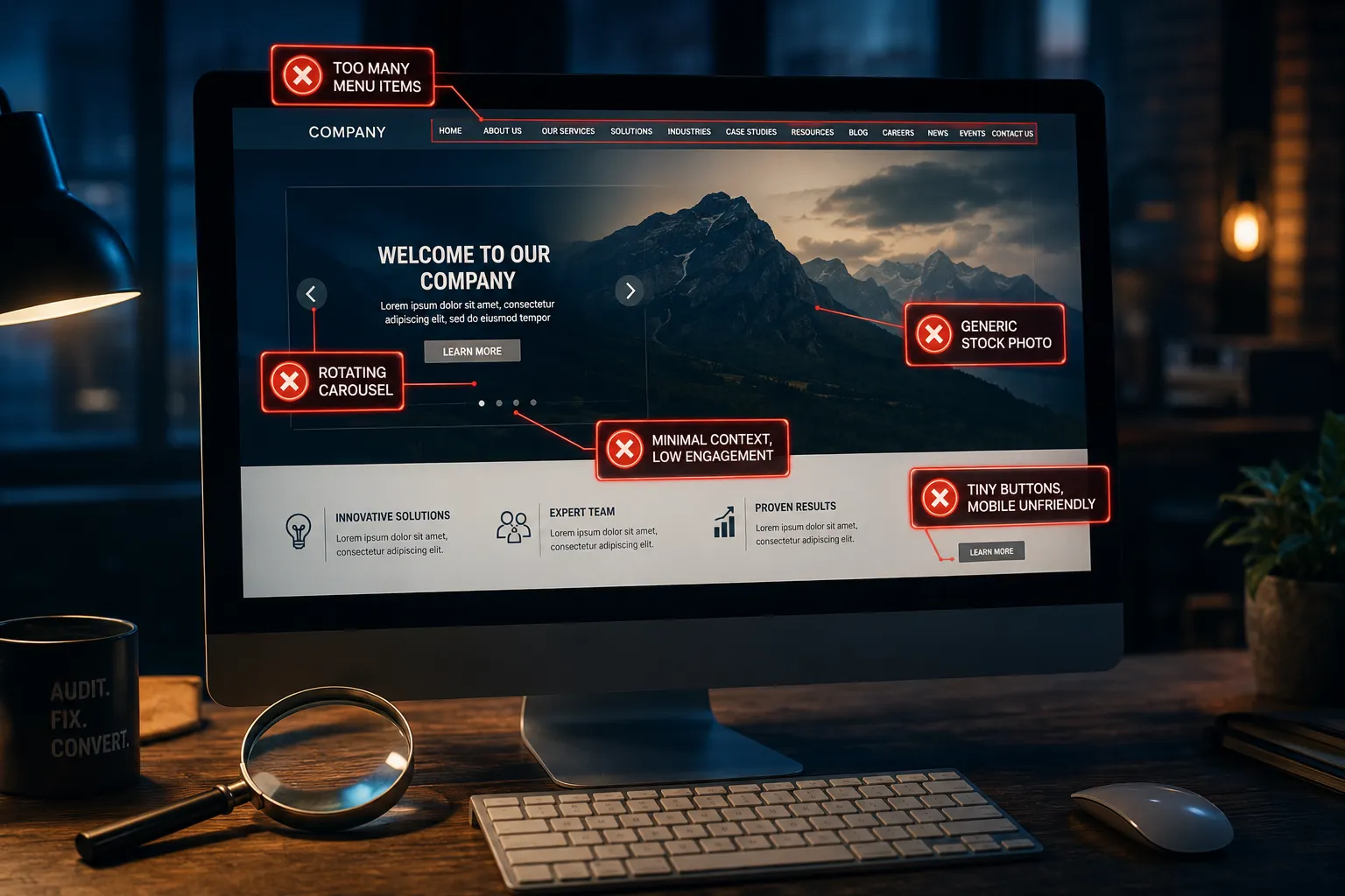
Common mistakes in the hero section include vague headlines like "We help businesses grow," multiple CTA buttons competing for attention, stock photos that add no information, and rotating carousels that delay understanding. The headline should state the specific outcome you deliver. The subheadline should clarify who it's for. The CTA should use action-oriented language like "Get a Free Quote" or "Book a Demo" .
How to Write Homepage Copy That Converts
Homepage copy that converts speaks directly to the visitor's problem, uses plain language, and guides readers toward a single action. Effective copy prioritizes benefits over features and addresses objections before they arise .
Follow this framework:
- Headline: State the outcome (e.g., "Cut Your Accounting Time in Half")
- Subheadline: Name the audience and method (e.g., "Automated bookkeeping for freelance designers")
- Body sections: Address pain points, present your solution, show proof
- CTA: Use specific, low-risk language ("Start Free Trial" beats "Submit")
Choose benefit-driven copy if your product is complex or premium-priced. Choose feature-driven copy if your audience is technical and already knows what they need. Write at a 7th-grade reading level with short sentences, active voice, and no jargon unless your audience expects it.
Homepage CTA Button Placement and Wording
A high-converting homepage places one primary CTA above the fold, repeats it at natural decision points throughout the page, and uses action-specific wording that tells visitors exactly what happens next. The button should stand out visually from all other elements .
CTA best practices:
- Use contrasting colors so the button is instantly visible
- Write in first person ("Get My Free Plan" outperforms "Get Your Free Plan")
- Place a secondary CTA after the trust section, not above the fold
- Limit to one primary action per section
Wording matters: "Get Started" is vague. "Start My 14-Day Trial" is specific and tells the visitor what to expect. Specific CTAs reduce uncertainty and increase clicks .
Common mistake: Adding social media icons, newsletter signups, and blog links near the primary CTA. These create exit paths that pull visitors away from converting.
Homepage Trust Signals and Social Proof
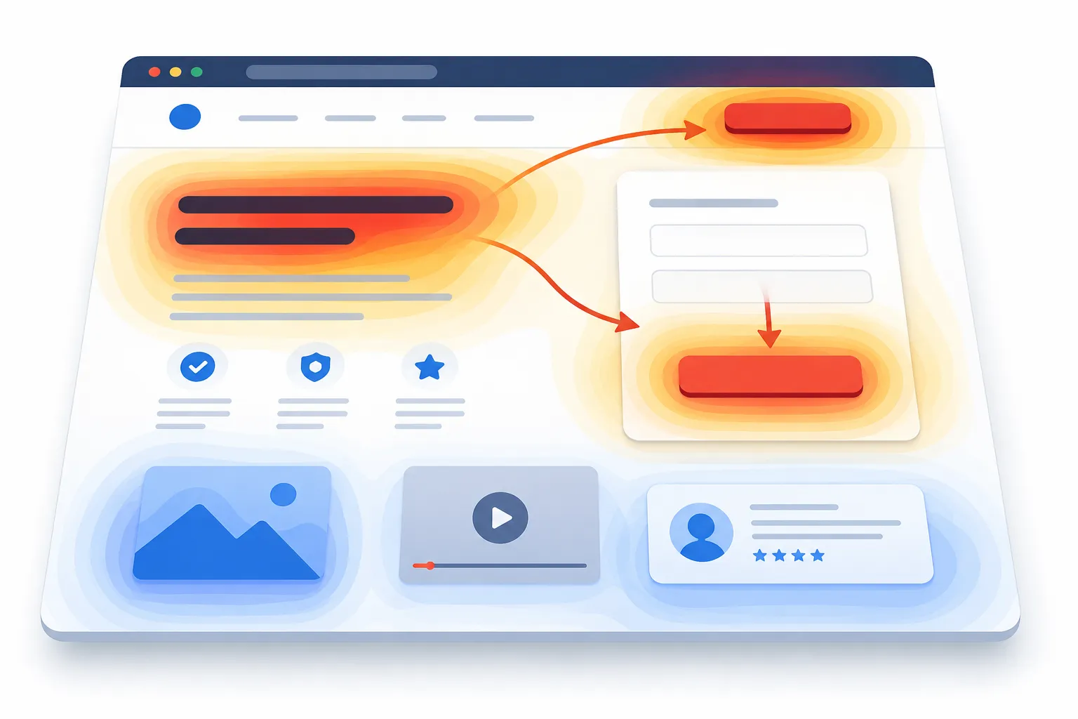
Trust signals convert hesitant visitors by proving that others have benefited from your product or service. The most effective trust elements are specific testimonials, client logos, case study links, certifications, and measurable results displayed near the CTA .
Place trust signals strategically:
- Above the fold: One short client quote or a row of recognizable logos
- Mid-page: Detailed testimonials with names, photos, and results
- Near the CTA: Trust badges, guarantee text, or security certifications
Edge case: If you're a new business with no testimonials yet, use product guarantees, free trial offers, or transparent pricing as trust substitutes. A "no credit card required" note near the CTA can reduce signup anxiety significantly.
Avoid generic star ratings without context. A testimonial that says "This saved us 10 hours per week" converts better than five stars with no explanation.
Homepage Design Elements That Increase Leads
The design elements that most increase homepage leads are a clean layout with generous white space, a logical visual hierarchy, fast-loading images, and a single-column flow on mobile. Good design reduces cognitive load so visitors focus on the message, not the layout .
How long should a homepage be? Long enough to address every objection a visitor might have before clicking the CTA, but short enough that nothing competes for attention. Most converting homepages use 5-7 sections: hero, problem and solution, benefits, social proof, CTA, and footer.
Should you use video on your homepage? Video can increase time on page and conversions, but only if it loads fast and delivers a clear message. Use video if your product is visual or complex. Skip it if it slows page load below 3 seconds, because speed affects conversions more than video does .
Homepage vs Landing Page for Conversions
A homepage introduces your brand and serves multiple audiences, while a landing page targets one specific audience with one offer and one CTA. Landing pages convert at higher rates because they eliminate navigation options and focus entirely on a single action.
| Factor | Homepage | Landing Page |
|---|---|---|
| Purpose | Brand intro, multiple paths | Single offer, single action |
| Navigation | Full menu | None or minimal |
| Audience | Broad, mixed intent | Specific, known intent |
| Typical conversion rate | 2-5% | Higher (single-focus design) |
| Best for | Organic traffic, brand searches | Ad campaigns, email links |
Decision rule: Send paid traffic to a landing page, not a homepage. Use the homepage for organic visitors who are still exploring.
How to Write a Homepage That Converts: Mistakes to Avoid
The most damaging homepage mistakes are unclear value propositions, too many CTAs, slow page speed, missing trust signals, and copy that talks about the company instead of the customer. Each of these increases bounce rates and suppresses lead generation .
Top mistakes to fix:
- Company-centric copy: "We are a leading provider…" should become "You'll save 10 hours per week…"
- Too many menu items: Each link is an exit from the conversion path
- No mobile testing: Buttons too small, text too tight, forms unusable on phones
- No social proof above the fold: Visitors leave before scrolling to testimonials
- Generic CTAs: "Learn More" tells visitors nothing about the outcome
Best homepage examples that convert share common traits: they lead with a specific promise, show proof immediately, and make the next step obvious. Study high-converting homepages in your industry and note how they handle the hero section, trust placement, and CTA wording.
How to Optimize Homepage for Mobile Conversions
Mobile optimization requires a thumb-friendly layout, single-column design, large tap targets, and forms that require minimal typing. Over half of web traffic comes from mobile devices, so a homepage that only works on desktop is leaving leads behind .
Mobile-specific fixes:
- Increase button size to at least 44×44 pixels
- Use sticky CTAs that stay visible as users scroll
- Shorten forms to name and email only
- Compress images to keep load time under 3 seconds
- Test on real devices, not just browser dev tools
Common mistake: Designing the desktop version first and "adapting" it for mobile. Start with the mobile layout, then expand to desktop. This forces you to prioritize the most important content.
How to Test Homepage Changes for Better Conversions
Testing homepage changes requires changing one element at a time, measuring the result against a defined conversion goal, and running the test long enough to reach statistical significance. A/B testing produces reliable data; guessing does not .
Steps to test effectively:
- Identify the weakest section using heatmaps or analytics
- Form a hypothesis (e.g., "Changing the CTA from 'Learn More' to 'Start Free Trial' will increase clicks")
- Create two versions: the original (A) and the variant (B)
- Run the test for at least 2 weeks or until you reach 1,000 conversions
- Implement the winner and test the next element
Test in priority order: Headline first, CTA wording second, hero image third, then layout. These elements have the largest impact on conversion rate .
FAQ
What is a good homepage conversion rate?
A 2-5% conversion rate is solid for most small-business homepages. Pages below 2% typically have problems with clarity, trust, or friction that suppress conversions .
How many CTAs should a homepage have?
One primary CTA, repeated at 2-3 natural points on the page. Multiple competing CTAs dilute focus and reduce overall conversion rates.
Should my homepage have a video?
Use video only if your product is visual or complex and the video loads quickly. Page speed affects conversions more than video does, so skip it if it pushes load time past 3 seconds .
What is the difference between a homepage and a landing page?
A homepage introduces your brand to a broad audience with multiple navigation paths. A landing page targets one audience with one offer and one CTA, which is why landing pages convert at higher rates.
How long should my homepage be?
Long enough to address every major objection before the CTA, typically 5-7 sections. Avoid adding sections that don't directly support the conversion goal.
What should I test first on my homepage?
Test the headline first, then CTA wording, then the hero image. These elements have the largest impact on whether visitors convert or leave .
Do trust signals really matter?
Yes. Testimonials, client logos, and certifications reduce visitor anxiety and increase form submissions. Place at least one trust signal above the fold .
How do I write a headline that converts?
State the specific outcome you deliver in plain language. "Cut Your Accounting Time in Half" outperforms "We Help Businesses Grow" because it names a concrete result.
Conclusion
Learning how to write a homepage that converts comes down to three principles: be clear, be trustworthy, and make the next step obvious. Start by auditing your current homepage against the five pillars of conversion (clarity, relevance, value, trust, and low friction). Fix the hero section first, then add trust signals, then simplify your CTA. Test one change at a time and let data guide your decisions.
Actionable next steps:
- Write a headline that states a specific outcome for a specific audience
- Replace competing CTAs with one primary action
- Add one trust signal above the fold
- Test your homepage on a mobile device
- Run your first A/B test on the headline within the next 30 days
A homepage that converts isn't about clever design or fancy copy. It's about removing barriers between the visitor and the action you want them to take.